


By Gregor Elgee
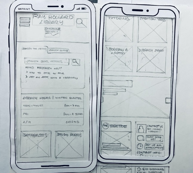
A new Shoreline.edu website administered by the Public Information Office (PIO) will go live mid April. Students can expect a new interactive layout, including a redesigned class schedule, upgraded directory, and a new email interface, all of which will conform to a viewer’s screen size.
Sean Duke, the Assistant Director of Marketing and Communications and project manager of the new website, says that he hopes this new “responsive” design will increase use from current users and new visitors alike, especially on mobile devices.
“With about a third of all traffic to shoreline.edu coming from mobile devices, it’s important to give a good user experience,” says Duke. “One of the biggest benefits is the responsive design that makes it fit your screen. I expect current students will really notice this, especially when they use the class schedule.”
Essentially, new CSS code will resize the website to fit your screen much the way a digital image is resized when a mouse drags it from a corner. The image isn’t cropped, it simply shrinks or grows based on the user’s interaction. The website does this automatically, eradicating the need for a mobile site which can become burdensome for users who have to scroll horizontally and vertically to read tiny phone text.
“If you visit the current site on a phone it should ask you if you want the desktop version or mobile version. It’ll ask you again 30 days later,” says Duke
While it’s a plus for mobile users, it is also a plus for administrators who will no longer have to edit both a mobile and desktop version of the website.
Gavin Smith, the Database and Web Applications Programmer at Shoreline, who has been working specifically on the class schedule, email system, and directory programs of the new site, says the responsive design will not only look good but will also make it easier for students to register and navigate their classes.
Classes listed in the Class Schedule will now be linked to a professor’s’ contact information as well as Google Maps so that students don’t have to open up new tabs to search for these things separately. Students can now click on a professor’s name in Class Schedule to easily get their directory information and can now click on the room number of a class to see a Google map if they’re having trouble navigating through campus.
Although the PIO has been getting feedback from students since fall quarter, some are concerned that the front page of the website may not represent the current student population.
“We have stuff going on around campus that people would probably like to know about, such as the Transgender bathrooms,” Chronos Chow, Associated Student Government Communications Officer, says. “Right now it just looks like an advertisement for new students.”
Additionally, Christopher Hahn, a second year web design student contributing to the website, thinks the most important things Shoreline college needs to convey aren’t currently displayed.
Hahn says that accessibility for students who have impairments such as blindness, could be accommodated better: incorporating tags on images to explain what a picture is conveying. He also says an even distribution of content for both current and prospective students is important.
The PIO has been collaborating with some 120 faculty, staff, and students on the website since September of 2015.